Medical Museion
Visual Identity Redesign
Redesigning the Medical Museion’s visual identity.
Our main concept of our redesign was that the museum shouldn’t only be a scientific experience; it must largely reflect the meeting between science and art, and make the abstract more tangible and add nuances to the factual.
Medical Museions building is used in the their current logo and consists of floor plan from the viewed from the side. Therefore wanted to use the logo in the new visual identity. We focused on the floor plan of the building and drew a grid from based on it. Afterwards we uses the grid in the rest of the visual identity.
To make the logo unique and recognizable, we added rounded corners to several of the letters. The round shape is based on the auditorium in the grid, which is a very recognizable part of the museum. We also chose the colors based on colors we found in the museum
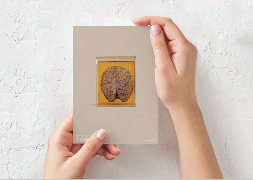
I wanted to make the poster a work of art, in order to attract another target group and focus on the abstract part of the museum. The poster follows the grid and consists of two elements from the museum. The fact that the images are masked makes it less morbid to look at, which could otherwise scare people. The simplere posters, would be used for postcards and for visitors to buy.


